Text Fields
Text fields allow users to enter letters and/or numbers in these fields. Lucity text fields vary from four to 100+ characters in length. Contact Name fields, Comment fields, etc.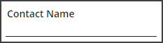
Text Field Component Information
Use the Component Information pop-up  to edit the field's properties.
| Field | Description |
|
Property Name |
Identifies the property associated with the field(s). This relationship helps third-party developers correlate form data with the properties available in the back-end. |
|
Label |
Sets the text that will be displayed on the form. |
|
Hidden |
Indicates that the field should be hidden. This is useful for simplying forms while still setting a default values for the field. |
|
Required |
Forces the user to enter information in this field in order to save the record. Note: The Required property for the Category field is "True" by default. For all other fields, the Required property is "False" by default. |
|
Read Only |
Designates the field as read-only, which prevents the user from entering data on this form. |
|
Carry Over |
Enables/disables the green Carry Over button for the selected field. To prevent users from seeing Carry Over buttons throughout the entire form, the grid the form is attached to must be edited to hide the Display Carry Over Buttons button. More details Note: Fields marked as read-only never display the Carry Over button in Lucity Web, even if this option is enabled. |
|
Width |
Sets the width of the field. This is automatically changed when the field component is adjusted in the Form Layout Editor. |
|
Max Length |
Displays the number of characters allowed in the field. |
|
Height |
Sets the height of the field. This is automatically changed when the field component is adjusted in the Form Layout Editor. |